In today’s visually-driven business world, data visualization tools such as the Marimekko chart prove to be a valuable instrument. But what is a Marimekko chart, and how does it carry relevance in the sales landscape? This article will deep dive into this data visualization tool, its significance in sales, how it is constructed, and the impact it can bring to sales strategy. Keep reading to unravel its potential.
Unraveling the Definition of a Marimekko Chart
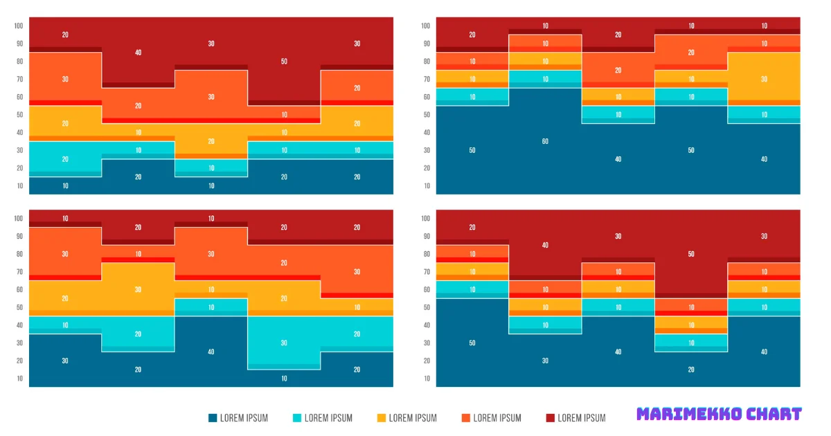
A Marimekko chart, also known as a mekko chart, is a two-dimensional bar chart used for multifaceted data visualization. Utilized within various business sectors, it serves as an efficient tool to represent complex data in a manner that is not only visually appealing but also easy to comprehend.

The chart gets its name from the Finnish textile company Marimekko, known for its strikingly colorful and large-print fabrics that the chart’s visualization mirrors. This is because the chart uniquely presents a variation of the bar graph with variable widths.
So, what is a Mekko chart in detail, you might ask? The power of a Marimekko chart lies in its ability to represent numerous categories and subcategories simultaneously. It enables the viewer to understand the proportion of each section within the bigger picture.
This data tool paints a comprehensive picture of the marketplace in terms of your product or service’s performance against competitors and illustrates key areas of opportunity and growth.
See Also: How Do I Convert Data to an Interactive Map in Excel?
The Significance of Marimekko Charts in the Sales Landscape
In a competitive environment like sales, the easy interpretation of data is crucial. Mekko charts can deliver such easily digestible data, leading to informed decision-making.
When it comes to analyzing market share, understanding revenue distribution across segments, or gaining insights into product contribution, the Mekko chart provides a visually captivating solution.
With this tool, sales teams can simultaneously view multiple dimensions of data. By allowing the comparison of various aspects of market analysis side by side, the Mekko chart leads to quick insights and assists in strategic planning.
Simply, it brings an abundance of complex information together into a single graph, making data trends easily identifiable, as they literally “stand out” in bold color.
Key Components and Creation of a Marimekko Chart
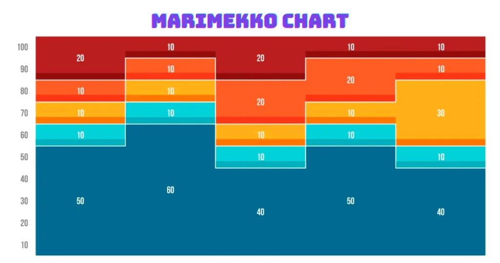
The foundational elements of a Mekko chart are the width and height of bars, that represent two distinct data dimensions. The width is proportional to the total representation of a category, while the height depicts a particular sub-category within that category.
Building a Mekko chart involves initially identifying the variables, and then plotting them against each other. The challenge lies in ensuring that the scale is accurate for it to truly represent the data dimensions. Specialized software like Excel, PowerPoint, or other visualization tools can help create Marimekko charts, as manual creation can be labor-intensive. Various templates and add-ons are available to make the process even smoother.
The creation of a Marimekko chart, though seemingly complex, results in an easy-to-read, colorful tableau of information, which can directly aid in strategy formulation and decision-making.
Must Read: How to Create a Dashboard in Power BI
Case Study: Effective Use of Marimekko Chart in Sales Analysis
Consider an example from the pharmaceutical sector. Here, a Marimekko chart can give a company a snapshot of its market position compared to its competitors.
This snapshot can include data like drug market share, sales revenue, patient population, and more, with each represented in a way that allows easy comparison and subsequent decision-making.
The visuals colorfully highlight where the company stands vis-a-vis the competition and indicate potential areas of growth or concern. As a result, planning future strategies becomes more targeted and informed.
The case study herein stands as a shining example of how Marimekko charts in sales analysis can facilitate decision-making processes by offering insights into areas needing attention.
Overall, Marimekko charts hold the potential to revolutionize how sales data is perceived and utilized. By presenting complex information in an accessible manner, this tool can provide invaluable insights for businesses, aiding in effective decision-making and more successful sales outcomes.