
Power BI is one of the fastest-growing data analytics tools available today. If you have decided to adopt the business analytics tool in your organization, you need to understand the basics of the Power BI dashboard. It is essential to be able to create dashboards as per your business requirements.
Power BI lets you design good backgrounds, create excellent visual elements, and simplify life for designers as well as end-users.
How Do You Create an Interactive Dashboard?
As you open the software, a blank white screen appears. This is like a plain canvas. What you do with this and how well you make your dashboard will determine your business intelligence. Everything depends on the Power BI dashboard – from how you will interpret data to making decisions and predicting future outcomes.
So, before we get to actually making dashboards, let us delve deeper into the importance of the same.
- Quickly turns unintelligible data into actionable information
- View all metrics at a glance and analyze business performance
- Create data visualizations from many datasets
- Customize dashboards to meet specific enterprise requirements
- Unified user experience
- Share a dashboard and collaborate anytime, anywhere
See Also: Why Data Is Important in Business
It is pretty simple – A perfect dashboard needs no further explanation!
A great dashboard is practical, logical, uncluttered, and visually appealing. It is a single page that gives a clear understanding of the underlying data. You need to know how to display a combination of data visuals and tell a compelling story.
7 Simple Steps to Create a Dashboard in Power BI:
Step 1: Collect the Data
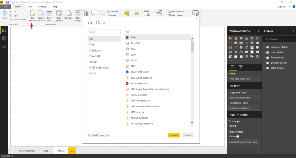
Once you launch the Power BI application, you can import your data from MS Excel. You will find a ‘Get Data’ button on the lower-left corner of the screen or at the bottom of the navigation pane.
The navigation pane shows the ‘Files’ option. Click on it and locate your excel file. Then click on the ‘Connect’ button. Depending on the file size, it may take a few moments to upload/import the data onto the dashboard.
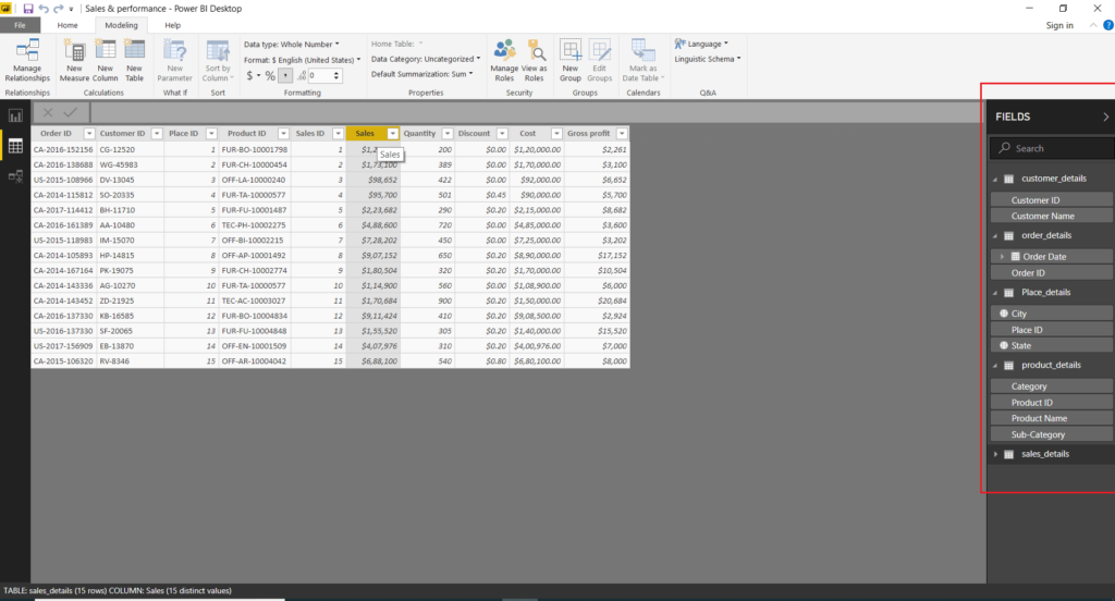
Now, the blank screen turns into a visualization creation tool. There are many options on the navigation panes for you to build interactive visuals.
Time to do the real work!
Step 2: Discover Your Dashboard
Power BI dashboard has many icons to represent visualizations. These include bar charts, columns, pies, column charts, stacked bars, half donuts, line graphs, area charts, waterfall charts, etc. Get familiar with the icons and functions.
There are Home, View, Modeling, and Help tabs on the top bar. Visualizations and Fields sections appear on the right. You can choose a particular visual and edit it using the Visualizations section. A Fields section allows you to select and switch between different data fields. The section contains all data you imported. Just select fields and add them to your visual.
You May Like: Does Data Visualization Have an Impact On SEO?
Step 3: Choose the Chart
While you have started exploring your dashboard and are off to a great start, it is important to ascertain which type of chart will be most appropriate for which kind of data.
Data visualization can be misleading. To get it right, keep in mind that:
- Pie charts indicate percentages. All values in your pie chart must add up to a hundred.
- Stacked charts represent a combination of composition and comparison.
- Scatter plots show the relation between two variables. For example, the amount of inventory required is based on demand predictions.
- Column and bar charts are best for distribution and comparative analysis. The employees and their salaries can be shown using these. You can compare different ranges of salary. Users can also use bar and column charts to show periodic data.
- Area charts and line charts can be used to compare data and view time-series data. For instance, if you want to find out how the company has grown over the last 20 years, a line chart can provide the most suitable visual representation.
Step 4: Formatting
The ‘Data’ tab enables you to access the imported tables and data sets. You can view them in a tabular form and select a table to perform formatting actions. The BI and analytics tool comes with a host of pre-defined shapes, colors, and fonts. You can customize all the features in your Power BI dashboard to obtain just the insights YOU are looking for!
Also Read: How to Choose the Best DCIM Software
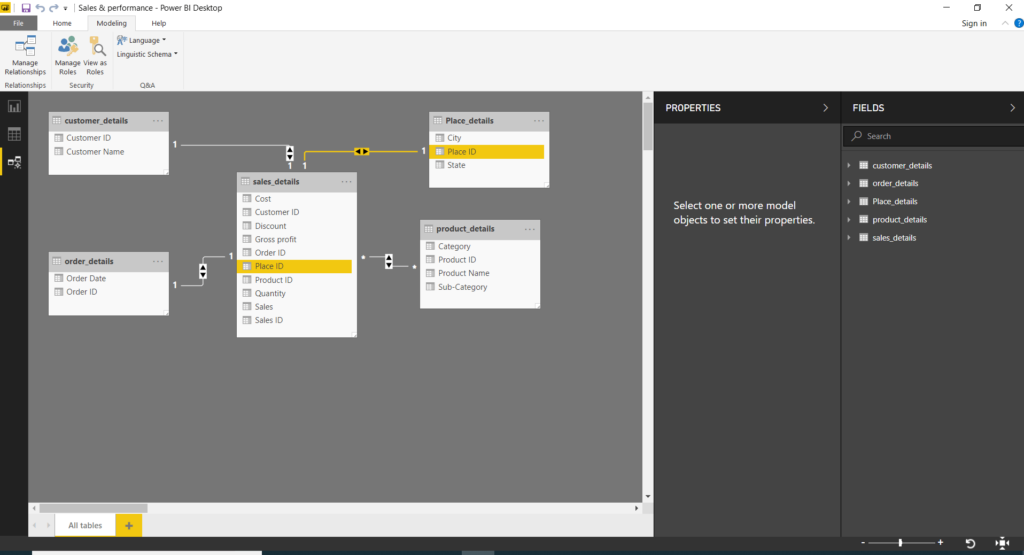
Step 5: Modeling
The Power BI engine has the capability to create relationships and associations between the tables that you load. Along with this, you can customize the data model by using the ‘Mode’l tab present on the left horizontal bar. These relationships are indicated by links joining two common fields.
Step 6: Final Touch
We have all the visuals and graphics on our dashboard. Now, adjust and resize the visualizations on the dashboard as you prefer. Remember to keep the dashboard as clean and clutter-free as possible. Make it look appealing using a dashboard theme. But remember, simplicity is the best policy!
See Also: What Should Companies Do to Protect Cloud Data?
Step 7: Save & Publish Your Dashboard
Hurray, your dashboard is ready with insightful charts! Don’t forget to click on the ‘Save’ button and secure the dashboard for future reference.
You can also publish the dashboard and share it with everyone on the team. Go to the ‘Publish’ option and log into your Power BI account to publish the dashboard on the web. Then, all users can access the dashboard via a shared link.
You May Like: Benefits of ERP & Retention Ideas
Customized Dashboard in Power BI
Creating Power BI dashboards using pre-built data visuals is easy. However, customizing the dashboard for your organization and gaining maximum insight into your business data is more challenging. You can explore so much more once you have the Power BI license. There are endless custom capabilities that the in-demand BI tool boasts. Make analysis simpler, spot trends faster, and predict outcomes better.
As you plan to get started, Uneecops Business Solutions (UBS) help you leverage the value of your data by guiding you to build custom, business-specific dashboards. We have enabled many companies to transform decision-making using our business intelligence services. We are India’s most trusted Power BI partners who support end-to-end implementation, migration, and managed services.
Arif Rashid is the Assistant Manager (Marketing) at Uneecops Business Solutions, with expertise in marketing and communication strategies. Providing support to a service-based company Uneecops in SAP, BI & ERP solutions.